Disclosure: As an Amazon Associate, ilcastellomenu.com earns from qualifying purchases. The product mentions in this guide are editorial: we link only to items that genuinely fit the topic, and a link never changes what we recommend checking, comparing, or avoiding.
With monitor color gamut explained in plain terms, half the confusion in monitor shopping evaporates. Gamut is simply the range of colours a screen can produce — its palette. Standards like sRGB and DCI-P3 are agreed palettes, and a monitor’s job is to cover the palette your content was made in: cover too little and colours look muted; produce far more than the content expects, unmanaged, and colours look lurid. This explainer defines the main standards, explains what coverage percentages really mean, and shows which gamut matters for gaming, photography, video, and office work.
The practical payoff is immediate: you will know why the colour-critical screens in Best Monitors for Color Accuracy quote the figures they do, and why a bigger percentage is not automatically a better screen for your desk. Colour accuracy — how faithfully the palette is rendered — is gamut’s partner concept, and the two are distinguished carefully below.
Monitor Color Gamut Explained: What a Gamut Actually Is
Imagine every colour a device can make plotted as a shape on a chart of all visible colour. That shape is its gamut. Screens build colour from red, green, and blue primaries, so their gamuts are triangles whose corners are set by how pure those primaries are. A wider gamut triangle encloses more saturated colours — deeper reds, richer greens — but says nothing by itself about whether the colours inside are shown correctly. That second quality is accuracy, and it is possible to have a wide gamut rendered inaccurately, like a large vocabulary spoken with a strong accent.
Content is mastered to a standard gamut: the creator’s colours are chosen from that palette, and your screen should reproduce that palette faithfully. This is why ‘more gamut’ is not a universal good. A wide-gamut screen showing sRGB content without colour management stretches the smaller palette across its bigger triangle, and everything — skin tones most noticeably — becomes oversaturated. Managed correctly, the same screen maps the content palette precisely and keeps its extra range in reserve for content that uses it.
In this guide
The Standards You Will Meet: sRGB, DCI-P3, Adobe RGB, Rec. 2020
sRGB — The Default Language of the Web
sRGB is the standard palette for the web, Windows, games’ standard modes, and most everyday content. Full sRGB coverage is the baseline requirement for any monitor; a screen covering noticeably less will mute everything you do. When a listing says a panel covers a high percentage of sRGB, that is table stakes being marketed — necessary, not impressive.
DCI-P3 — The Cinema and Modern Video Palette
DCI-P3 is a wider palette from digital cinema, now the working standard for HDR content, modern phones, and much video production. A monitor covering most of DCI-P3 is equipped for HDR films and games and for video editing. High DCI-P3 coverage is the wide-gamut figure that matters to most buyers today, and it headlines the spec sheets in Best Monitors for Color Grading.
Adobe RGB — The Photography and Print Palette
Adobe RGB stretches differently — particularly in greens and cyans — to match what quality printing can produce. Photographers who print, and designers working to print pipelines, look for high Adobe RGB coverage so the screen can preview printable colour. If your output is screens only, Adobe RGB coverage is largely irrelevant to you, however impressive the percentage.
Rec. 2020 — The Horizon
Rec. 2020 is the very wide target palette of UHD standards — an aspiration current panels approach but do not reach. You will see it quoted as a partial coverage figure on high-end screens. Treat it as a direction of travel for the industry rather than a buying criterion today.
Coverage Versus Volume, and Other Spec-Sheet Traps
Two measurements hide behind the same percentage. ‘Coverage’ asks how much of the standard palette the screen can reach at all. ‘Volume’ compares the screen’s total colour solid against the standard’s — and can exceed one hundred percent, because the screen’s triangle pokes outside the standard in some directions while still missing corners of it. A panel can therefore advertise a large volume while under-covering the palette your content needs. Coverage of the specific standard you work in is the honest figure; when a listing is vague about which it quotes, assume the flattering one.
Also check the fine print for the colour depth beside the gamut: most panels are 8-bit (about 16.7 million addressable colours), some use frame-rate control to simulate 10-bit, and true 10-bit pipelines serve professional video work. Depth governs smoothness of gradients — banding in skies and shadows — while gamut governs the extremes of saturation. They are independent axes, and confusing them is another spec-sheet trap this explainer exists to disarm.
Which Gamut Matters for Your Work
Office and web work: full sRGB, accurately rendered, is the whole requirement — the picks in Best Computer Monitors for Photo Editing exceed it, but your documents will never know. Gaming: sRGB for standard titles, strong DCI-P3 for HDR titles on capable panels. Photography for screens: sRGB accuracy first; for print: Adobe RGB coverage joins the brief. Video: DCI-P3 is the working palette of modern production and HDR delivery, so coverage there is a professional requirement, and uniformity and calibration support matter alongside it.
Notice the pattern: the question is never ‘how wide’ but ‘which palette, how completely, and how accurately’. A mid-tier screen with full sRGB, strong DCI-P3, and good factory calibration serves more real work than a wider screen with sloppy accuracy. This is why creator roundups lead with accuracy measurements and treat gamut as a qualifying threshold — and why How to Choose a Monitor ranks panel and calibration above exotic specifications for creative desks.
Colour Management: Making Wide Gamuts Behave
Colour management is the operating system and application layer that maps content palettes to your screen’s palette correctly, using a profile (ICC) that describes your specific display. On a standard sRGB screen you can ignore it; the defaults align. On a wide-gamut screen it becomes essential: colour-managed applications (browsers, photo editors, professional tools) will render accurately, while unmanaged ones may oversaturate. Modern operating systems handle most everyday cases well, but the classic symptom — everything looks neon after upgrading to a wide-gamut panel — is a management gap, not a faulty screen.
Two practical tools keep you honest. First, the monitor’s own sRGB mode clamps its palette to the standard for unmanaged work — the quick fix for oversaturation, at the cost of parking your wide gamut until you switch back. Second, a calibration device builds a precise profile of your actual panel and corrects its rendering — the professional answer, discussed in How to Adjust a Monitor. Between them, most users find the sRGB mode sufficient and the calibrator a creator’s investment.
Common Misconceptions
Misconception one: ‘Wider gamut means better colour.’ It means more possible colour; better colour is accuracy, and unmanaged width actively harms it for standard content. Misconception two: ‘A screen with 125 percent sRGB volume covers sRGB fully and more.’ Volume is not coverage; corners can still be missing. Misconception three: ‘Gamut and brightness are related.’ They are independent — a dim screen can be wide-gamut and a bright one narrow. Misconception four: ‘My eyes can judge calibration.’ Eyes adapt relentlessly and are wonderful comparators but poor absolute instruments; that is why profiles and measurements exist.
The final misconception is that gamut is a gaming luxury or a creator fetish with nothing between. In truth it decides whether the red your game intends, the brand colour your client specified, and the skin tone your family photo holds are the reds, colours, and tones you actually see. Everyone who looks at a screen has a stake in it; only the required palette changes. The photography-focused screens in Best Monitors for Photo Editing show the concept applied at its most demanding.
Gamut in the Wild: Phones, TVs, and Why Your Photos Change Rooms
Your images already travel between gamuts daily. A phone photographs in a wide palette, displays it on a P3 screen, uploads it to a service that converts it to sRGB, and your monitor shows the converted version — each hand-off a small act of translation that good colour management makes invisible and bad management makes garish or dull. Understanding gamut explains the classic puzzles: why the same photo pops on your phone and sleeps on your monitor (different palettes, and possibly an unmanaged conversion), and why prints come back muted from saturated screen images (the printer’s palette is smaller and differently shaped, which is precisely the gap Adobe RGB exists to preview).
The lesson for buyers is that your screen is one citizen in a colour ecosystem. Choose its palette to match the ecosystem you serve: the web’s sRGB, video’s P3, print’s Adobe RGB — and ensure the devices you judge against (your phone, your clients’ screens, your printer’s proofs) are part of the same conversation.
Uniformity and Viewing Angle: Gamut’s Silent Partners
A gamut figure is measured at one point — usually the centre, at one brightness. Real panels vary: edges can run slightly different in colour and brightness from the centre (uniformity), and VA panels shift colour as your angle changes, so the palette at the corner is not the palette at the middle. For judged work, uniformity matters as much as the headline gamut, and it is a property reviews measure and spec sheets omit. This is why two monitors with identical gamut claims can serve a photographer unequally, and why creator shortlists weigh measured uniformity alongside coverage. When you audition a screen for colour work, display a flat mid-grey and a flat saturated colour full-screen: your eyes are excellent uniformity instruments even if they are poor absolute ones.
A Practical Audit: Checking Your Own Screen’s Colour Behaviour
You can learn more about your current screen in ten minutes than its spec sheet ever told you. Display a saturated red, green, and blue full-screen, one at a time, and compare against your phone showing the same colours: dramatic differences reveal palette gaps or unmanaged paths. Display a smooth gradient — a sunset photograph serves — and look for banding steps that betray bit-depth limits. Display a flat mid-grey and walk your viewing angle: colour that shifts as you move is angle behaviour, the VA signature, made visible. Finally, open a photograph you know well — a face you love — and judge skin tone above all: it is the colour human vision is most expert at auditing, and the one every palette in this explainer ultimately serves.
None of this requires instruments, and all of it converts this explainer’s abstractions into your own panel’s biography. If the audit delights you, your screen’s gamut story is settled. If it indicts your panel on the exact axis your work cares about, you now know precisely which figure to shop for — which is the entire purpose of understanding gamut before the catalogue starts talking.
Choosing Your Next Screen by Gamut: A Three-Question Method
When gamut enters your own purchase, three questions settle it in order. First: what palette does your content speak — sRGB for the everyday web, office, and standard games; DCI-P3 for HDR entertainment and modern video; Adobe RGB for print-bound photography? Second: does the candidate screen cover that palette essentially fully, quoted as coverage of the named standard rather than as an unlabelled volume? Third: is the screen’s accuracy — its factory calibration, its uniformity, its honest sRGB mode — strong enough to render that coverage faithfully, as judged by measurements rather than by the width of its claims? A screen passing all three is a colour tool; a screen passing only the second is a palette in search of a hand to guide it.
Notice what the method omits: the widest number wins nothing, and last year’s flagship gamut figure is this year’s mid-tier table stakes. Gamut done right is a threshold to clear on the way to judging accuracy, uniformity, and ergonomics — which is why the creator roundups linked throughout this explainer read the way they do, and why your next screen, chosen by these three questions, will show you colours you can defend.

A Worked Example: One Photograph Through Three Palettes
Take a photograph with a difficult colour in it — a deep teal sea under a bright sky, or a market stall of peppers in reds that shade toward orange — and follow it across three screens. On a screen that covers the standard web palette fully and no more, the photograph looks exactly as it will look on most of the world’s screens: the teal is rich, the peppers are vivid, and nothing is missing because the photograph’s own colours, as saved for the web, live inside that palette by construction. The screen is not limiting the picture; the file is the limit, and the screen honours it completely.
Now open the photograph’s original wide-gamut version, straight from a modern camera, on the same screen. The deepest teal and the most saturated pepper reds fall outside the standard palette, and the screen must guess — clipping them to the nearest colour it can show, compressing neighbouring shades into sameness. The picture still looks good; it simply contains less colour information than the camera captured, in exactly the places the scene was most colourful. Move to a wide-gamut screen with colour management engaged, and those shades separate again: the sea gains depth bands, the peppers regain their individual reds. That separation — not vividness, not punch — is what a wider gamut actually buys, and it only exists when the file, the software, and the screen all speak the wider palette together.
Break any link and the example collapses instructively. The wide-gamut screen without colour management shows the web version of the photograph oversaturated, its ordinary reds pushed past their intent — wider palette misused as louder volume. The managed wide screen showing the web file shows it correctly and identically to the standard screen. Gamut, the worked example teaches, is capacity, not intensity: a library’s shelf space, valuable exactly when your books are large, and no virtue at all when it merely makes the small books shout.
Bit Depth, Explained Beside Gamut
Bit depth is gamut’s most confused neighbour, so place them side by side. Gamut is the range of colours a system can represent — the size of the palette. Bit depth is how finely that palette is divided — the number of distinct steps between its extremes. A standard 8-bit system divides each colour channel into 256 steps, yielding the familiar millions of combinations; a 10-bit system divides into over a thousand steps per channel, yielding over a billion. The extra steps do not widen the palette by a single shade. They smooth it: gradients — skies, shadows, skin — can transition without visible banding, because the steps between neighbouring tones shrink below the eye’s detection.
The confusion arises because wide-gamut work genuinely needs the extra fineness: spread the same 256 steps across a wider palette and the gaps between them grow, inviting banding in exactly the smooth gradients professionals stare at. Hence wide-gamut screens and 10-bit pipelines travel together in serious workflows, and marketing, smelling a pair, sells them as one feature. Keep them separate in your judgement. A buyer can need depth without width — the video editor fighting banding in standard-palette footage — or width with modest depth, in casual wide-gamut gaming where gradients are rarely scrutinised.
One more trap lives here: panels that accept a 10-bit signal but render it with fewer true steps plus dithering, a technique that flickers between neighbouring shades so the eye averages them. Done well, dithering is visually respectable and powers many fine screens; the dishonesty is only in listings that print the input number as the panel’s nature. Reviews that test gradients will tell you what your eyes would eventually report: smooth is smooth, whatever the mechanism, and banding is banding whatever the specification promised.
Profiles and Colour Management: The Machinery That Makes Gamut Behave
Colour management is the unglamorous machinery that lets different palettes coexist without lying to each other, and it runs on profiles: small files that describe exactly what a device’s colours are. Your monitor has a profile, ideally measured from your individual unit, that tells the system the true meaning of every signal sent to it. Colour-managed applications — the professional editors, the better browsers, the operating system’s own image handling — read the file’s palette and the monitor’s profile together and translate, so a colour specified in the file appears as itself on your particular screen, wide or standard.
Where the machinery is absent, the signal is sent raw, and raw signals mean different colours on different palettes — the oversaturated web on a wide-gamut screen being the famous symptom. The practical landscape has improved steadily: modern operating systems and browsers manage the common cases well, while games and some older applications remain unmanaged territory where a wide-gamut screen will show its colours at full, unintended saturation. A buyer whose week is mostly games should know this plainly: in unmanaged content, wider gamut reads as more vivid, which some players love as an enhancement and others reject as a distortion, and both are describing the same unmanaged translation failure from opposite tastes.
Maintaining the machinery is light work. Use the profile the manufacturer provides or the one your calibrator creates, confirm the operating system has it assigned to the screen, and after any driver or system upheaval, glance at a familiar photograph to confirm the household still agrees with itself. Colour management fails silently when it fails, and the familiar photograph — your peppers, your faces — is the household’s canary.
Gamut for Video: Streaming, Broadcast, and the HDR Connection
Video’s palettes have their own history that intersects the monitor question at HDR. Standard television and streaming were built on a palette close to the web’s, and most catalogue content still lives there. HDR content is mastered in the cinema palette, DCI-P3, delivered inside a larger container — which is why HDR and wide gamut arrive in the same sentence so often: the HDR signal assumes a screen that can reach into the cinema palette for its saturated highlights, the firelight and neon and sunset colours that HDR scenes are composed around. A screen with strong HDR brightness but a narrow palette will render those scenes bright and strangely plain, their most expensive colours clipped to the standard set.
For the streaming viewer, the practical weight of this is modest but real. Films and prestige series increasingly master in the cinema palette even in their standard versions, and a screen covering that palette fully shows them as graded. The viewer’s checklist is therefore short: full coverage of the standard palette as a non-negotiable floor, cinema-palette coverage as the genuine upgrade, and no credit given for percentages of palettes no content uses. Gamut marketing loves exotic denominators; content is the only denominator that pays.
Broadcast and sport lag the streaming services in palette ambition, which returns the decision, as ever, to the diary. A screen bought for matches and news gains little from width; a screen bought for films gains the exact colours its favourite scenes were finished in. Neither answer is a compromise — each is a correct allocation against an honest content list.
Choosing a Screen for a Child, a Student, or a Shared Family Desk
Not every desk is a professional’s, and gamut advice that ignores the household desk misleads most buyers. For a shared family screen — homework, browsing, streamed films, games across several people’s tastes — the gamut specification that matters is complete, accurate coverage of the standard palette, full stop. Accuracy at that palette means schoolwork prints predictably, photographs look like themselves, and nobody’s game is distorted. Wide gamut on such a desk buys unmanaged oversaturation in the children’s games and nothing the family’s content can use, a rare case of a higher specification being an active, if mild, negative.
The student’s desk adds one forward-looking consideration: coursework that touches colour — design, media studies, photography at any level of seriousness — changes the answer mid-degree, and a screen bought for the whole course should carry the cinema palette and an accurate standard mode if the student’s subjects even gesture toward visual work. The cost difference at purchase is usually smaller than the cost of replacing a screen in the third year, and the accurate modes protect the non-colour work meanwhile. This is the one household case where buying ahead of the content is justified, because the content’s arrival is scheduled by a syllabus rather than hoped for.
For the very young user’s first screen, spend the gamut budget on the desk’s other axes entirely — size, stand, eye comfort — and let the palette be standard and correct. Childhood’s screens are replaced on a rhythm that makes future-proofing a poor investment, and a correct standard palette is, for everything a young user will open, not a limitation but the native language of their content.
A Short Glossary for the Colour Shelf
Palettes breed terminology, so here is the shelf labelled in plain language. Gamut: the full range of colours a device or standard can represent. Coverage: how much of a named standard’s range a screen can show, the honest percentage. Volume: how much colour space a screen can produce in total, a number that can exceed a standard’s size while still missing corners of it — the reason volume figures flatter. Delta E: a measure of error between intended and shown colour, where smaller is more accurate and values below the low single digits are hard for eyes to fault. White point: the colour a screen calls white, usually a daylight standard, against which every other colour is judged. Calibration: adjusting a screen so its output matches its profile’s promises; profiling: measuring and describing what it actually does. Keep these six and the colour shelf holds no further mysteries worth a buyer’s money.
Two more terms guard the border with brightness. Luminance is simply how bright a colour is, the axis gamut diagrams flatten away — which is why a palette is really a volume, with dark saturated colours and bright pale ones occupying different storeys of the same building. Colour volume, used carefully, names that whole building rather than its floor plan, and it is the measure HDR cares about, since HDR’s signature colours are bright and saturated at once, living on storeys that standard screens do not have. When a listing’s gamut claim seems too simple, it is usually a floor plan being sold as a building.
None of this vocabulary needs memorising; it needs recognising at the moment a listing deploys it. The buyer who can ask of which standard, coverage or volume, at what brightness has disarmed most colour marketing with three questions — the same three this explainer has been teaching in longer form throughout.
Gamut Myths That Survive Every Explainer
Myth one: more gamut is always better. Refuted by every unmanaged game glowing neon on a wide screen and by every family desk in this guide — capacity unused is not quality, and capacity misused is a defect. Myth two: gamut and accuracy are the same virtue. A screen can reach a huge palette and render every colour in it wrongly, like a piano with extra keys that are out of tune; accuracy is the tuning, gamut the keyboard’s span, and music needs both in that order. Myth three: the percentages are comparable across brands. They are measured against different standards, by different methods, as coverage or as volume, and a smaller honest figure routinely describes the better screen.
Myth four deserves its own sentence because it sells the most screens: that your current content will look better on a wider palette. Content carries its own palette with it. A standard-palette photograph contains no hidden colours for a wide screen to reveal, any more than a paperback contains hidden chapters for a larger bookshelf. Wider gamut serves wider content — which exists, is growing, and may well be yours — but the upgrade it offers is to your library’s future and your camera’s originals, not to the finished files you already own.
The myths survive because each contains a grain arranged to mislead: width is a real capability, percentages are real measurements, and new screens do make old photographs look different. The explainer’s defence is the worked example’s discipline — follow one colour through file, software, and screen, and every myth loses its hiding place in the chain.
Your Own Screen, Audited: A Fifteen-Minute Colour Review
Everything in this explainer can be turned on the screen already on your desk, and the audit is worth its quarter hour before any upgrade is contemplated. Begin with the specification: find your model’s measured coverage in a review rather than its listing, and note which standard the figure describes. Then display the test patterns from the adjustment guide — a smooth gradient to expose banding, a plain grey for casts, and your most saturated familiar photograph — in a colour-managed application, and judge whether the screen’s behaviour matches its paperwork. Note especially whether reds separate into shades or merge into a single loud note, and whether skin tones stay believable at the brightness you work at.
Follow with the management check: confirm the operating system’s assigned profile for the screen is the manufacturer’s or a calibrator’s, not a generic placeholder, and view the same photograph in a browser and in your editor to see whether the household agrees with itself. Disagreement between applications is a management story, fixable in settings; agreement that both are wrong is a panel story, and a legitimate reason to shop. The audit’s product is a sentence — my screen covers this, behaves so, and fails there — which converts any future purchase from a leap into a targeted repair of named faults.
Owners who run this audit often discover their screen is better than its reputation in their own mind, its faults living in a missing profile or an unmanaged application rather than in its palette. Fix those first, live a week, and then decide whether the palette itself is the limit. That order — settings, management, hardware — is the cheapest sequence in all of colour, and it is the note this explainer wants to end on: gamut is a property of systems, and systems are usually repaired one honest link at a time. Screens whose audit ends in a genuine palette limit will find their successors compared in our graphic design monitor roundup, where coverage figures are quoted against the standards that matter.
Gamut and Print: The Round Trip From Screen to Paper
Print is where gamut stops being theoretical for photographers, because paper has a palette too — smaller than any screen’s in some directions, oddly extended in others, particularly in deep cyans and yellows that screens render weakly. The round trip from camera to screen to print crosses three palettes, and colour management’s soft-proofing exists to simulate the paper’s limits on the screen before ink commits the photograph to them. A photographer who prints should therefore value a screen whose palette covers the print palette’s neighbourhood — historically the argument for the Adobe RGB family of screens — because a colour the screen cannot show is a colour the proof cannot warn about, and it will announce itself instead on the finished print, at paper prices.
Home printing softens the requirement without removing it. Modern home printers and online labs mostly expect files in the standard palette and handle the translation themselves, so the household photographer’s screen needs honesty within that palette above all. The step to printing your own serious work — or using a lab that accepts wide-gamut files — is the step at which the wider screen earns its place in the chain, and it is a step defined by the destination of the file, not by the camera that captured it.
Keep one proof habit whatever your tier: view the final file, before printing, in the palette the printer expects, at the size it will be printed. More disappointing prints are born from palette surprises at that last step than from any deficiency of screens, and the habit costs one minute — the cheapest insurance in the whole colour pipeline, and a fittingly practical end to an explainer about ranges: what matters is never the largest palette in the chain, but that every link knows what the others can hold.
Gear for This Guide
Two verified panels whose pool titles state their gamut credentials openly — a DCI-P3-strong 5K IPS for Mac-based creators, and a 4K USB-C hub monitor built for colour-managed office work.
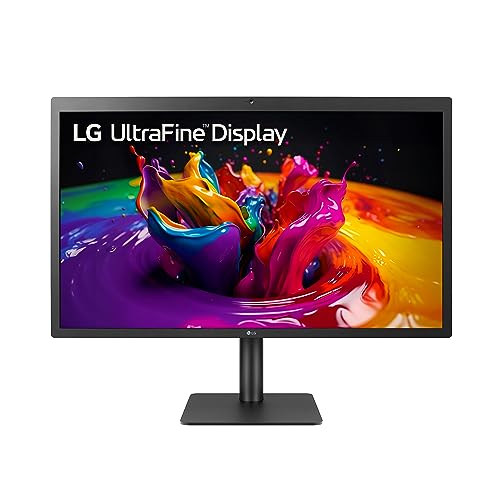
LG 27MD5KL-B UltraFine 27-Inch 5K IPS Monitor — A 5K IPS display quoting 99 percent DCI-P3 coverage in its specification — the video-and-photo palette at near-full strength, in a panel designed to pair with Mac workflows. Check on Amazon

Dell UltraSharp 27 4K USB-C Hub Monitor (U2723QE) — Dell’s colour-managed workhorse line in 4K IPS form: the kind of factory-calibrated, wide-gamut office panel this explainer recommends judging on accuracy as much as coverage. Check on Amazon
Frequently Asked Questions
What is a good color gamut for a monitor?
It depends on your content’s palette. For general use, full sRGB coverage is the requirement. For HDR games and video work, look for DCI-P3 coverage in the mid-ninety percent range or better. For print-oriented photography, high Adobe RGB coverage matters. Always read the figure as coverage of a named standard, and pair it with accuracy — a slightly narrower but accurate screen beats a wider, sloppy one for almost every real task.
Why do colours look oversaturated on my new wide-gamut monitor?
Because standard sRGB content is being stretched across your panel’s wider palette by an unmanaged path — the application or system is not mapping palettes. Fixes, in order: enable the monitor’s sRGB mode for everyday work; use colour-managed applications for photos and web; and on Windows ensure the correct ICC profile for your monitor is installed and active. The panel is not faulty; it is showing you more range than the content asked for, uncorrected.
What is the difference between gamut and colour accuracy?
Gamut is the range of colours a screen can produce — the size of its palette. Accuracy is how closely the colours it produces match the colours it was asked for, usually summarised by a Delta E figure in reviews. A screen can be wide and inaccurate, or modest and precise. For judged work — photos, brands, print — accuracy is the senior partner; gamut is the qualifying round.
Do I need DCI-P3 for gaming?
For standard (SDR) games, no — they are mastered in sRGB. For HDR gaming, yes: HDR titles use the wider P3 palette, and a screen that cannot cover it will mute the very scenes HDR exists to enrich. If HDR gaming is in your future, treat strong DCI-P3 coverage as part of the HDR hardware checklist alongside brightness and dimming, not as a separate luxury.
Is 10-bit colour the same as wide gamut?
No. Bit depth is how finely each colour channel is divided — 10-bit offers far more steps than 8-bit, smoothing gradients and reducing banding. Gamut is how far the primaries reach. A screen can be 8-bit and wide-gamut, or 10-bit and sRGB-only. Professional video cares about both; everyday users will notice banding in dark scenes (depth) more readily than missing saturation extremes (gamut).
Can a monitor have too much gamut?
For unmanaged standard content, effectively yes — the oversaturation problem. In managed workflows, no: extra range sits unused until content needs it. The practical answer is that wide gamut is an asset with a small management tax. If your work is entirely standard and you dislike fiddling, a excellent sRGB screen with an accurate factory tune is a perfectly rational stopping point.
Why do my photos look different on my phone and my monitor?
Because the two screens speak different palettes and one of the translations is unmanaged. Phones typically capture and display in the wider DCI-P3; monitors display what the operating system hands them, often sRGB. If the hand-off converts correctly, the images match closely; if an application ignores profiles, the wide-gamut original gets squeezed or stretched visibly. View the photo in a colour-managed application on both devices before blaming either screen — the difference usually lives in the software path, not the glass.
Does a wider gamut make games look better even without HDR?
Only if the game and the pipeline are colour-managed for it. Standard games are mastered in sRGB; on a wide-gamut screen without management they can look oversaturated — vivid, certainly, but not as the artists graded them. Many gaming monitors offer an sRGB clamp mode for exactly this reason. Where wide gamut genuinely flatters standard content is in the hands of players who prefer the stretched look and choose it knowingly; preference is legitimate, provided it is a choice rather than an accident of defaults.
How can I tell what gamut my current monitor has?
The manufacturer’s full specification states coverage figures for its panels; your model’s review coverage usually states them more honestly, including whether the figure is coverage or volume. If neither is available, the audit in this explainer gives you the experiential answer: saturated primaries compared against a known screen, gradient behaviour, and skin-tone honesty. For most owners the practical question is not the number but the verdict — does this screen show my content’s colours faithfully — and that verdict your own eyes, properly briefed, can deliver.
What gamut should I look for in a monitor for everyday home use?
Complete coverage of the sRGB palette, rendered accurately, is the correct and sufficient target for everyday use — browsing, documents, streaming in standard formats, and most games all live in that palette. Treat any additional width as relevant only if your hobbies reach into photography, video, or HDR film. A listing that cannot state its sRGB coverage plainly is telling you where its priorities lie, and accuracy within the palette — verified by reviews that measure it — matters more than any percentage beyond it.
Why do my photos look dull on my friend’s screen but vivid on mine?
One of the two screens is misrepresenting them, and the dull one is not automatically the guilty party. If your screen is wide-gamut and unmanaged, it may be inflating the colours beyond the file’s intent, making every honest screen look dull by comparison. If your friend’s screen has poor coverage of even the standard palette, it is genuinely losing colours the file contains. The referee is a colour-managed application on a screen with a known profile: view the file there, and whichever home screen agrees with the referee is the honest one.
Does a wider gamut make text or documents look better?
No — documents and text live entirely inside the standard palette, and a wider gamut changes nothing about their rendering except the risk, in unmanaged applications, of interface colours shifting more saturated than intended. Document quality is governed by resolution, scaling, contrast, and uniformity. This is a useful calibration of gamut’s importance: it is a specialist axis that matters enormously to colour content and not at all to the written word, and most desks contain far more of the latter.
Can I switch a wide-gamut monitor back to standard behaviour?
Yes, and the switch is the feature that makes wide-gamut screens safe for mixed desks. Most offer an sRGB mode that restrains the panel to the standard palette, which is the correct mode for web work, office content, and any colour judgement destined for ordinary screens. The quality of these modes varies — the best hold their accuracy carefully, lesser ones merely clamp and dull — so a wide-gamut finalist’s sRGB mode deserves the same review scrutiny as its headline palette. Buy the wide screen whose standard mode you would happily live in, because you will live in it most of the week.
If I shoot photos on my phone, do I need a wide-gamut monitor to edit them?
Modern phones capture in a wide palette and display on wide screens, so editing those photographs on a standard-palette screen means judging colours you cannot fully see — the deepest tones will be clipped to the palette’s edge on your monitor while remaining distinct on the phone. For casual editing and sharing, where the phone itself is the final judge, this matters little and the phone screen is your reference. For careful editing destined for varied screens and print, a cinema-palette monitor with good management lets you see the whole file you captured, and the difference is real rather than theoretical.
The Bottom Line
Gamut is the palette; accuracy is the handwriting. Learn which palette your content speaks — sRGB for the everyday web and office, DCI-P3 for HDR and video, Adobe RGB for print — require full coverage of that palette, and then judge screens on how faithfully they render it. Do that and the percentages on spec sheets turn from persuasion into information, which is all they ever should have been.
When a listing quotes a gamut percentage, ask the two questions this explainer taught you: of which standard, and is it coverage or volume? The answers separate information from decoration.
Related Guides
Keep going with these related guides and roundups from the same desk-setup cluster: